Samsung Galaxy S3 Review
Samsung Galaxy S3 Review
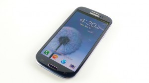
The Samsung Galaxy S3 is the newest phone on the block, with a stunning 4.8-inch 720p resolution capacitive touch screen display, an extremely slim and light design and a quad-core processor that runs at blazing speed. This bundle of Android goodness comes at a price though , and the more you use it , the quicker it eats up your battery life. It’s definitely not for for everyone, but expect it to give the iPhone a good run for its money.
The S3 goes on sale in the UK from 30 May and is being offered free on two-year contracts from £26 a month (or more), or you can pick it up SIM-free for between £500 and £520.
The S3 comes in 16, 32 or 64GB storage options but it also has a microSD card slot so you can further expand its great memory.
Samsung Galaxy S3 Design
The Samsung Galaxy S3 is, according to Samsung, ‘inspired by nature – it sees, listens, responds, and allows you to share the greatest moments’.
While this is all a little odd, the nature theme is certainly present when you handle the phone for the first time.
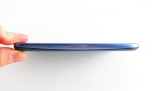
The phone is made from Brushed polycarbonate and you’ve got a choice of ‘Marble White’ and ‘Pebble Blue’ .The large device has dimensions of 136.6 x 70.6 x 8.6mm, despite still having to pack in a 4.8-inch Super AMOLED HD screen. There’s no doubt that the Pebble Blue version is the much more attractive option, as the Marble White looks similar to a low-end Galaxy Mini. The brushed effect makes the phone look very high-end and premium.
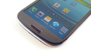
If we compare it to the rest of the Galaxy family, the S3 has more in common with the original Galaxy S than the S2, with curved edges that make is look reminiscent to its prequel. The home button has also been elongated, although the same menu and back buttons remain from the S and S2.
Overall, the the phone is much more like the Samsung Galaxy Nexus, with its HD Screen,Rounded edges, but with a larger screen, But if I’m honest I prefer the Galaxy Nexus’s design more because it looks a better and the inward curving screen and button less design makes it look more premium.
The buttons designs around the phone has been well thought out well, for a phone this big it’s very difficult to make all the keys easy to get to, so putting the lock button on the right-hand side rather than the top makes it a lot easier to use.
The addition of the lozenge-shaped home button, and its touch ‘Back’ and ‘Menu’ buttons are great additions, as it means menus can be found easily without needing to mess around looking for the on-screen icon.
The volume up and down button is on the opposite side to the lock key on the left-hand side of the phone, and also within easy reach when holding the Galaxy S3.
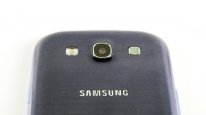
The microUSB slot is placed at the bottom of the phone. The battery cover is also made of the same polycarbonate material as the rest of the phone; Yes, the battery cover is removable!
Screen
The Galaxy S2 packs a Super AMOLED Plus screen, which means that for every pixel, there were three sub pixels (red, green and blue). This meant lovely contrast ratios and cleaner whites.
However, in order to facilitate the much higher resolution, Samsung has crammed in fewer sub pixels per pixel, which means a slightly less ‘clean’ colour close up.
The screen is very sharp though, when compared to the S and S2. Overall the screen is Big, Bright and Beautiful.
Camera
The camera on the Samsung Galaxy S3 is one of the biggest surprises from the Korean company, : it’s stuck at 8MP, The same as the Samsung Galaxy S2.
We don’t think this is much of a problem, the mobile phone doesn’t need any more than 8MP to take good quality snaps but Samsung has had high MP cameras in the past, so this is an interesting move.
Because of this Samsung have been able to make the device thinner. The hardware of the cmaera is very much the same as the Samsung Galaxy S2.
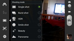
One of the big claims for Android 4.0 is the speed with which snaps can be shot when out and about, and that zero shutter lag is very effective here in the Galaxy S3. While there’s no dedicated shutter button, getting into the camera is easy as pie.
Conclusion
With the Galaxy S3, Samsung hasn’t messed with it past models much, recognising that slick design and a gorgeous screen were the secret to the Galaxy S2’s success. The S3’s oval shape may not be a love at first sight but that pebble-like design is absolutely stunning. Along with this Samsung has added an upgraded processor making it a phone that’s pretty much king in the speed and power department at the moment.
On the down side, the TouchWiz interface is occasionally annoying, and Samsung’s apps aren’t always up to scratch. If we put those minor software issues aside, the S3 will undoubtedly be one of the year’s most important Android gadgets, or even Gadgets all together. There are very few phones that come close to matching Apple’s high thrown, but with the S3, Samsung has got closer than anyone.

